Champions Ascension is Jam City's first NFT offering, using the "play to earn" model. These NFT characters would later be able to battle in an arena, with the goal of a full open world gameplay experience to come. After the success of their initial NFT launch, Jam City tasked my team with visualizing the open world, and working with production toward the first playable vertical slice.
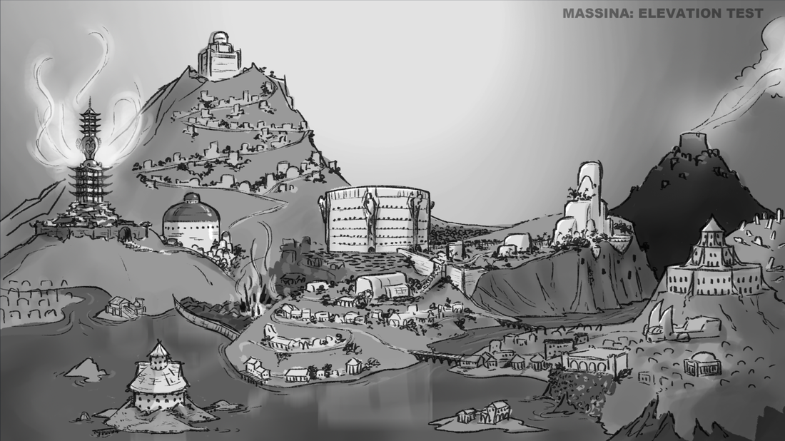
With the character style pre-established, and hundreds of pages of lore already written, my first task was to sync with the head of narrative. I wanted to know how each region differentiated from one another, so we could help them to feel unique. To begin the conversation, I used the rough map he provided (on left), to quickly sketch out some elevation, giving us the context to start a dialogue.
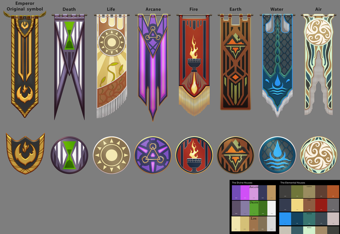
I knew we would have to flush out most of the city with a generic architecture style that could be procedurally generated. My idea was to allow the surrounding areas to affect that of a generic base style. So, depending upon how close each building is to a major "house", the more or less of that factions influence would dictate the elements that make up that building. It was my hope that this technique would assure that each area of the city felt different, all while allowing my team and I to complete it in a reasonable time. With that in mind, my team and I began with mood boards and confirming color palettes and materials for each faction's region.
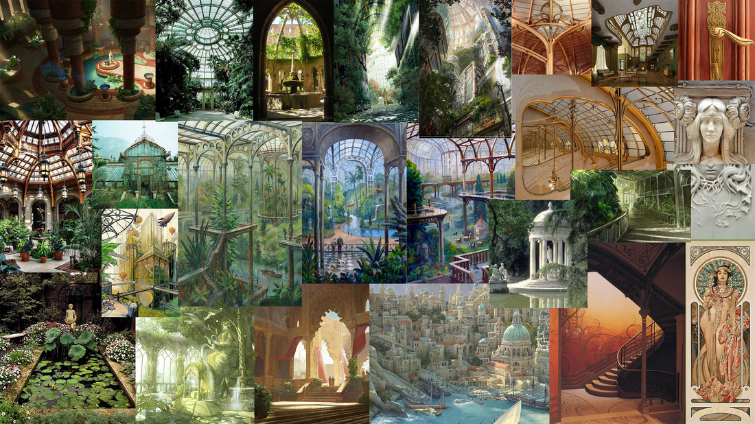
Because this world is not earth, it is very important that the structures feel familiar and relatable, but without drawing too much from a known human era. That would feel cheap and take the player out of the game. Below you'll see our first pass on each house's flag with color palette and iconography, as well as the mood boards for House of Life, and House of Death.
Because this world is not earth, it is very important that the structures feel familiar and relatable, but without drawing too much from a known human era. That would feel cheap and take the player out of the game. Below you'll see our first pass on each house's flag with color palette and iconography, as well as the mood boards for House of Life, and House of Death.
Now with a broad idea of how each house differentiates, we had to do hero concepts of the main architectural buildings near the area of our vertical slice, so we could establish rhythms that each surrounding building would echo.
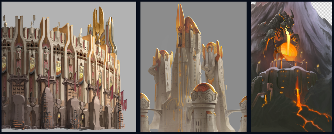
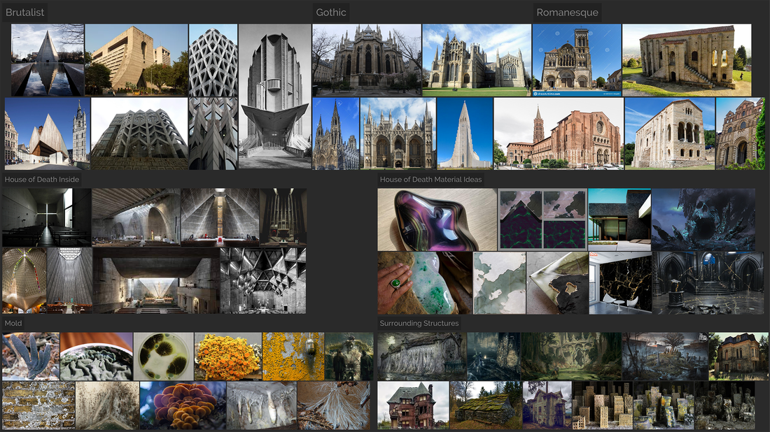
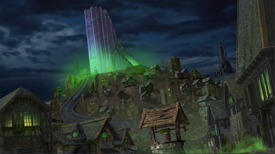
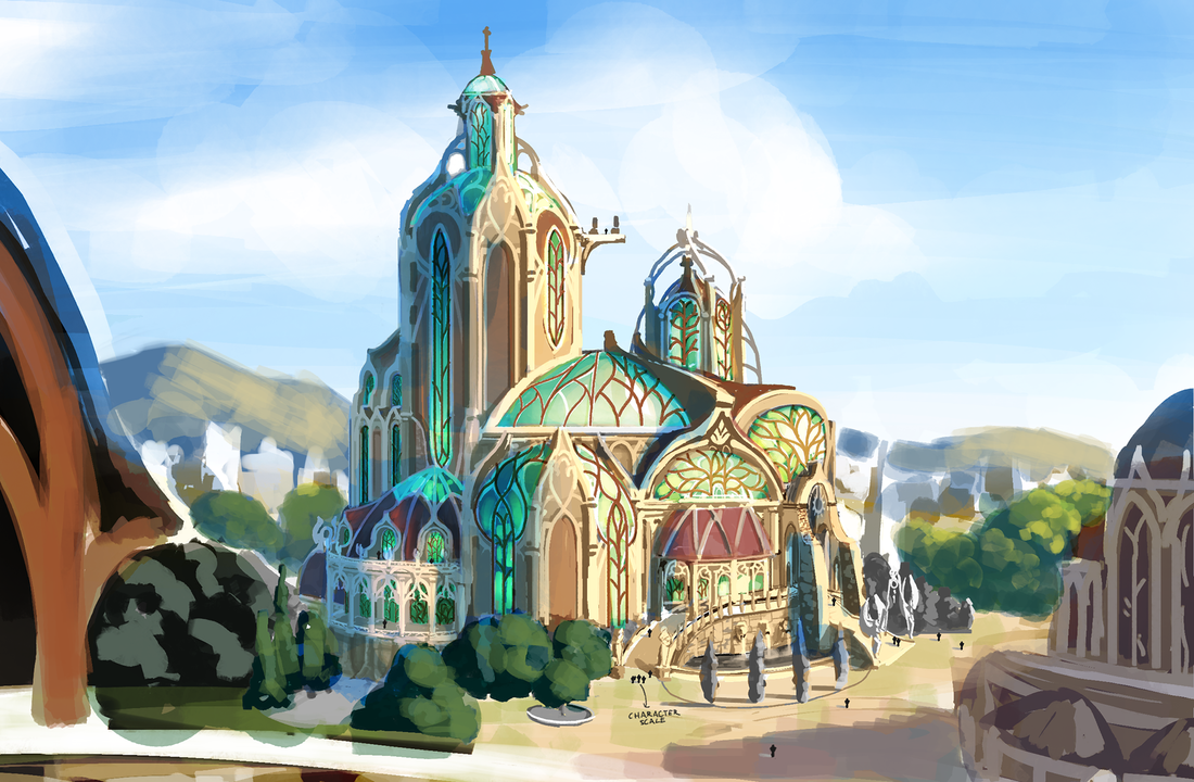
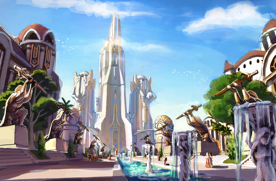
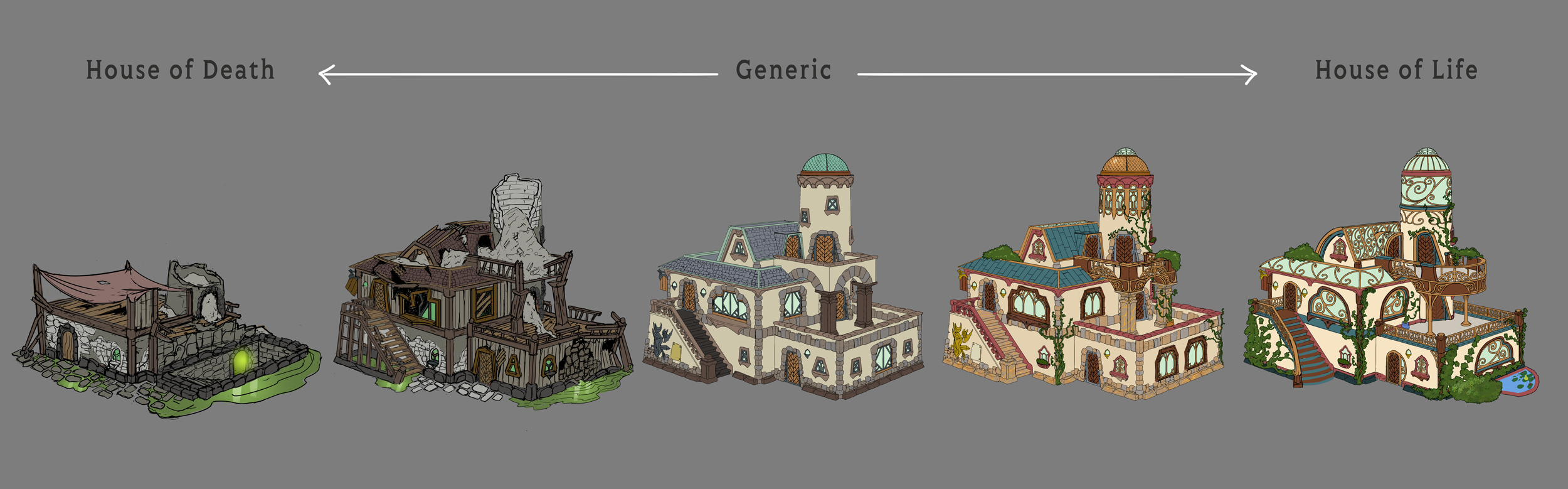
Below you see the House of Death, House of Life, and the Emperor's Palace concepts. These last two are especially important, since the color palettes were somewhat similar and we needed to differentiate them. Originally both the House of Life and the Emperors Palace utilized white stone and gold. Using the organic shapes of Art Nouveau, I chose to shift the HOL to use rough cream stone with faded red accents, to help pop the green of the overgrown plants. Then for metal I chose tarnished brass to shape the organic ceilings of open window light. In contrast the emperors palace was very overpowering, with tall ceilings of enclosed polished white stone and intimidating gold statues. While there are plants, all are meticulously manicured.
Below you see the House of Death, House of Life, and the Emperor's Palace concepts. These last two are especially important, since the color palettes were somewhat similar and we needed to differentiate them. Originally both the House of Life and the Emperors Palace utilized white stone and gold. Using the organic shapes of Art Nouveau, I chose to shift the HOL to use rough cream stone with faded red accents, to help pop the green of the overgrown plants. Then for metal I chose tarnished brass to shape the organic ceilings of open window light. In contrast the emperors palace was very overpowering, with tall ceilings of enclosed polished white stone and intimidating gold statues. While there are plants, all are meticulously manicured.
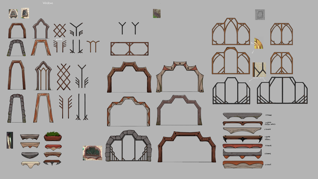
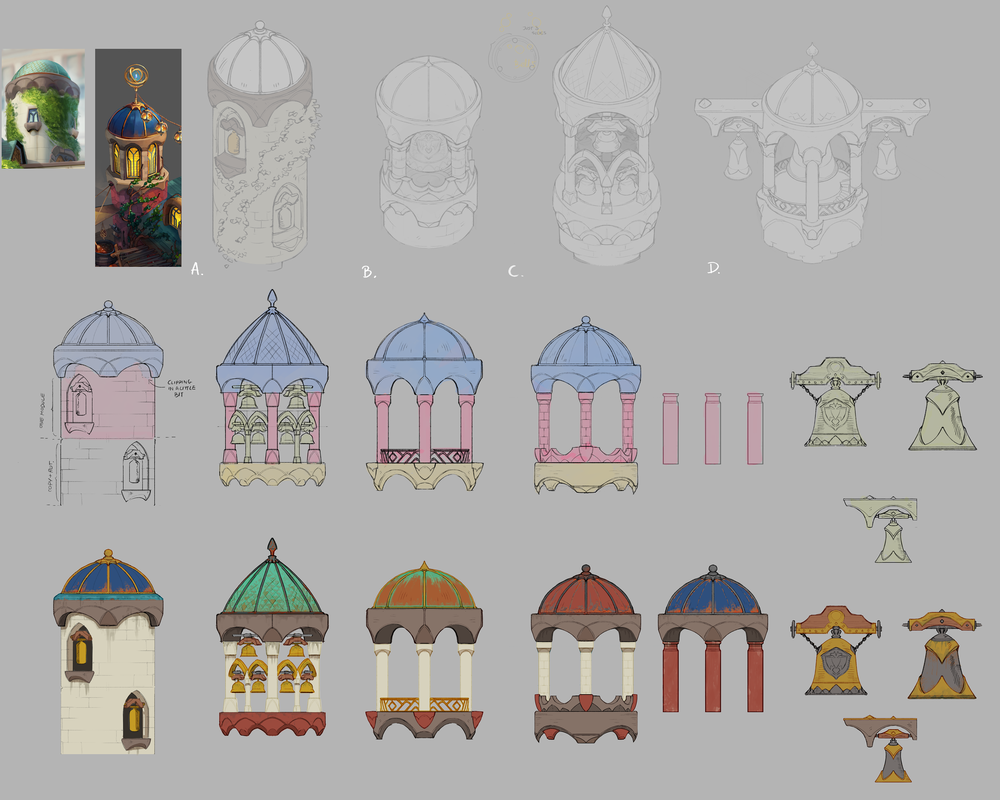
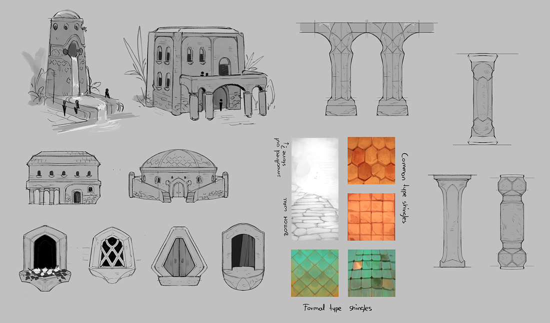
Now that some of the rules for major regions were established, we needed the generic architecture style that we would later use to procedurally flush out the majority of the cities structures. Below are some of those explorations.

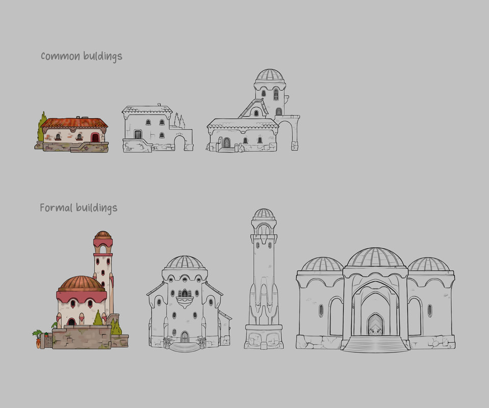
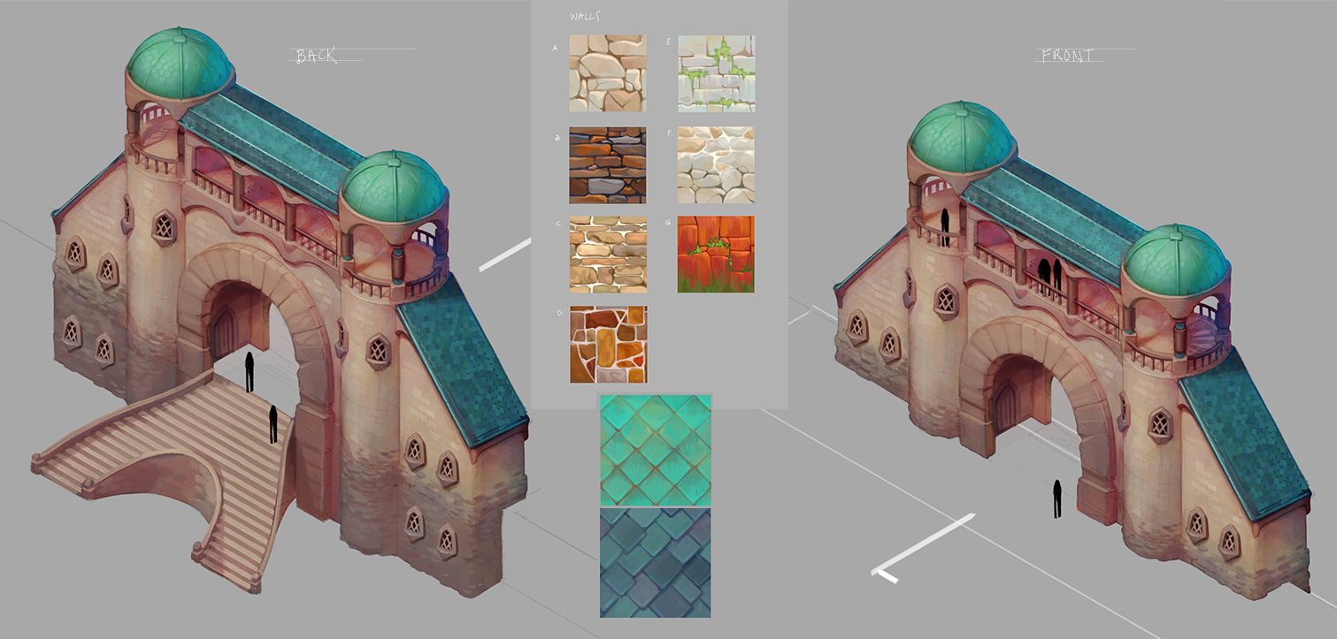
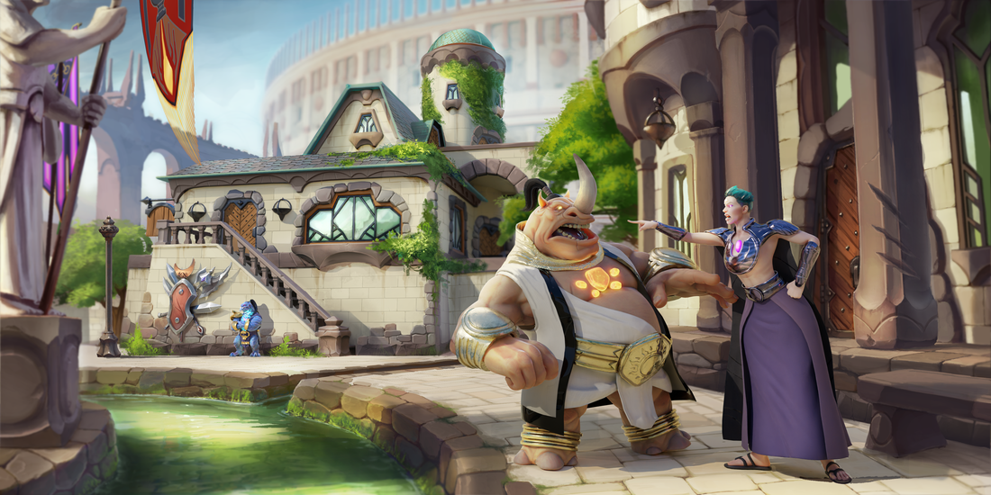
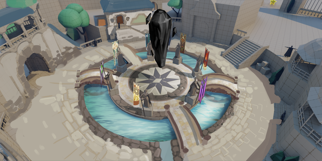
Next, we took one section of our vertical slice area, and flushed it out using our favorite rhythms. This was to be our mood and style benchmark for all generic architecture moving forward. Most importantly, it showcased all of the pieces that would be manipulated procedurally to create the city. It also helped us to visualize the characters in our environment, to make sure we were on the right track.
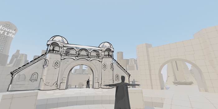
Once this image was approved, we blocked the town square out in rough 3D, then used draw and paint overs to hone in and tweak our evolving style.


Before I mentioned the generic structures would be our starting point with procedurally generating buildings, though as you moved away from one house and close to another, that house would influence the structures. This was our first pass at the matrix of a single generic structure moving from one house influence to another.
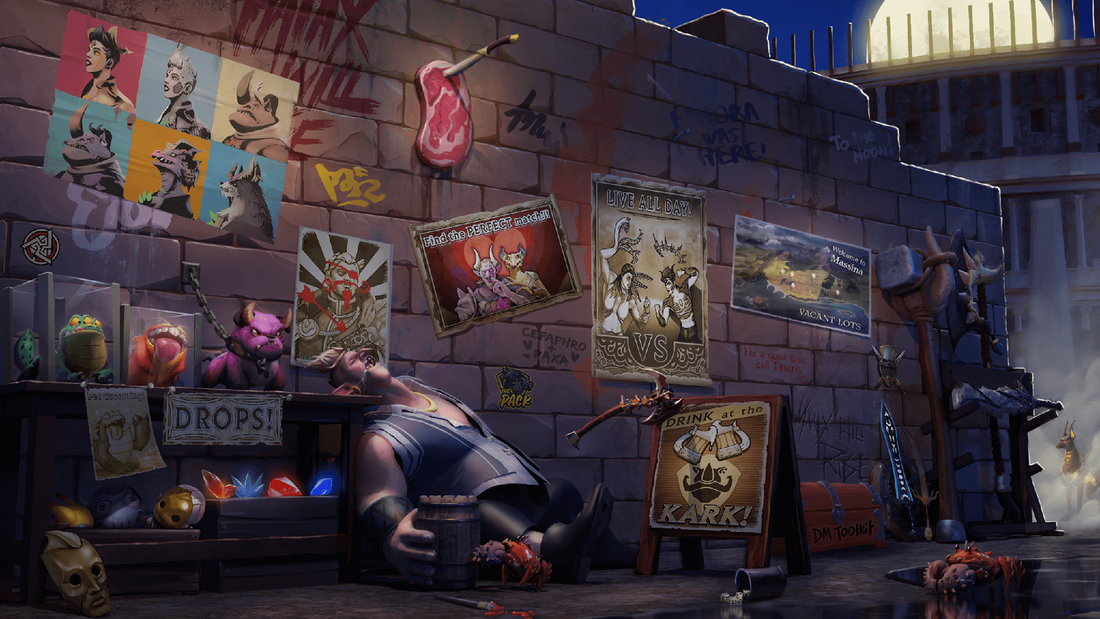
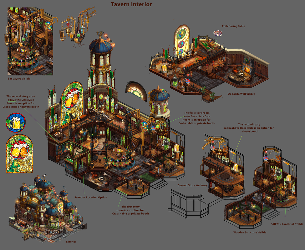
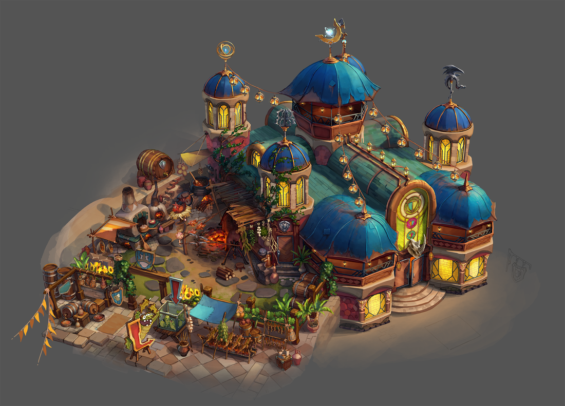
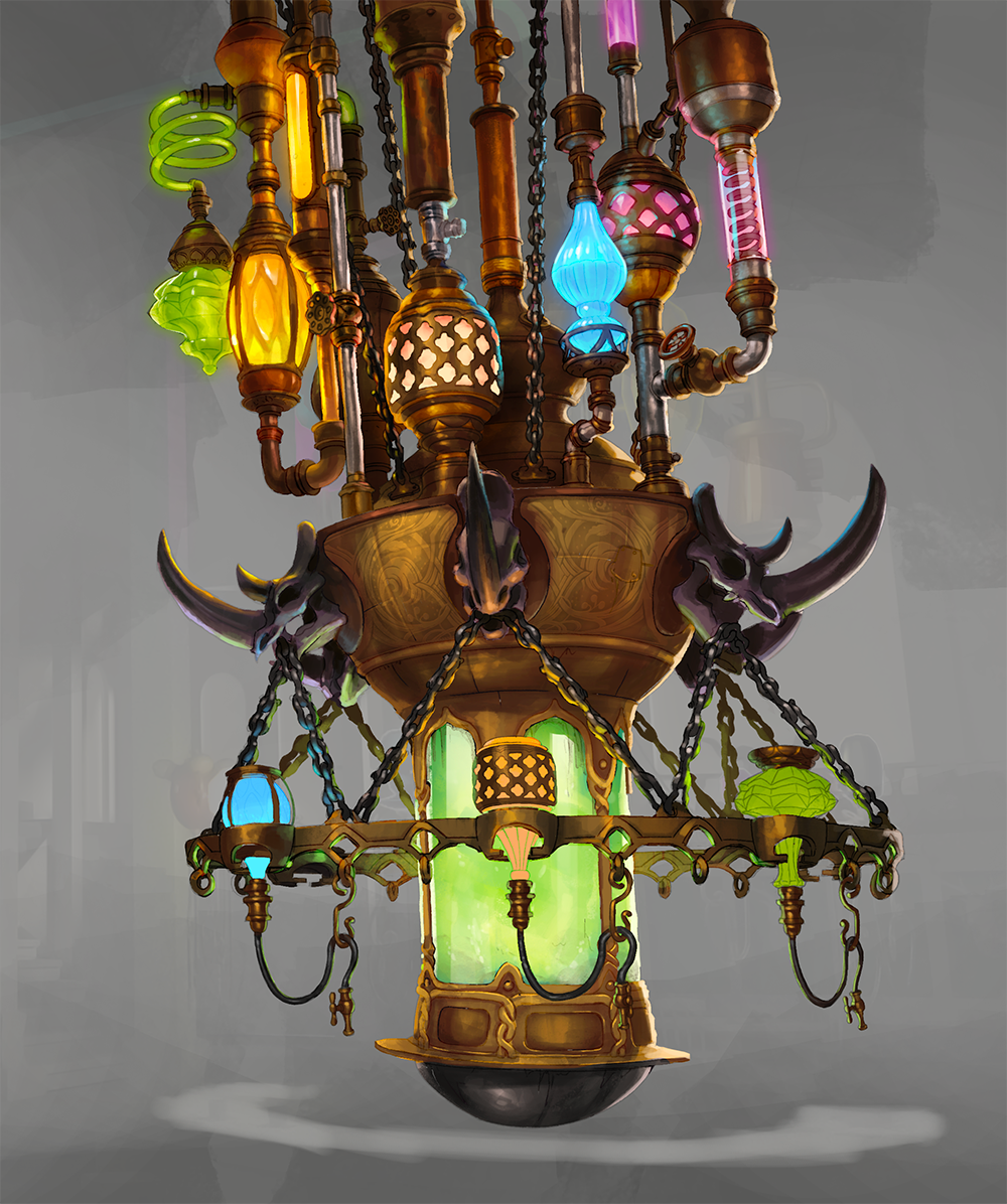
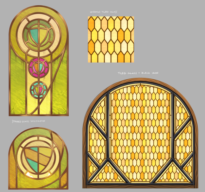
With the generic style coming into focus, we then started the main unique structure that players could go inside. This tavern was meant to welcome people from all areas of the city. Again, we needed it to feel familiar, but not clearly from known era. First, we pulled reference from everywhere, to quickly combine all of our ideas. Next we did a style consistency pass, to make sure everything felt unique and of this world. Lastly, we broke everything into detailed drawings with texture breakouts where needed, to inform 3D. Below are just a few of the many concepts created.
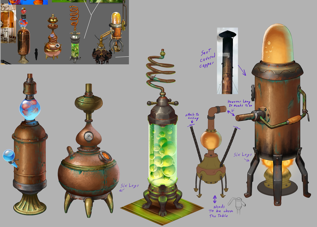

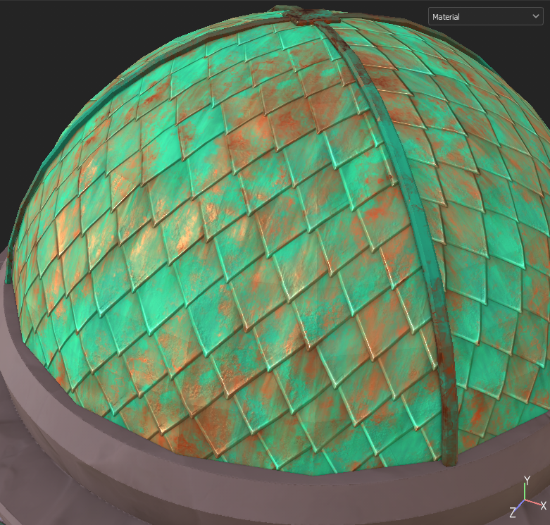
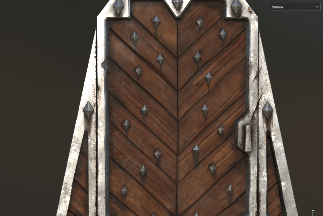
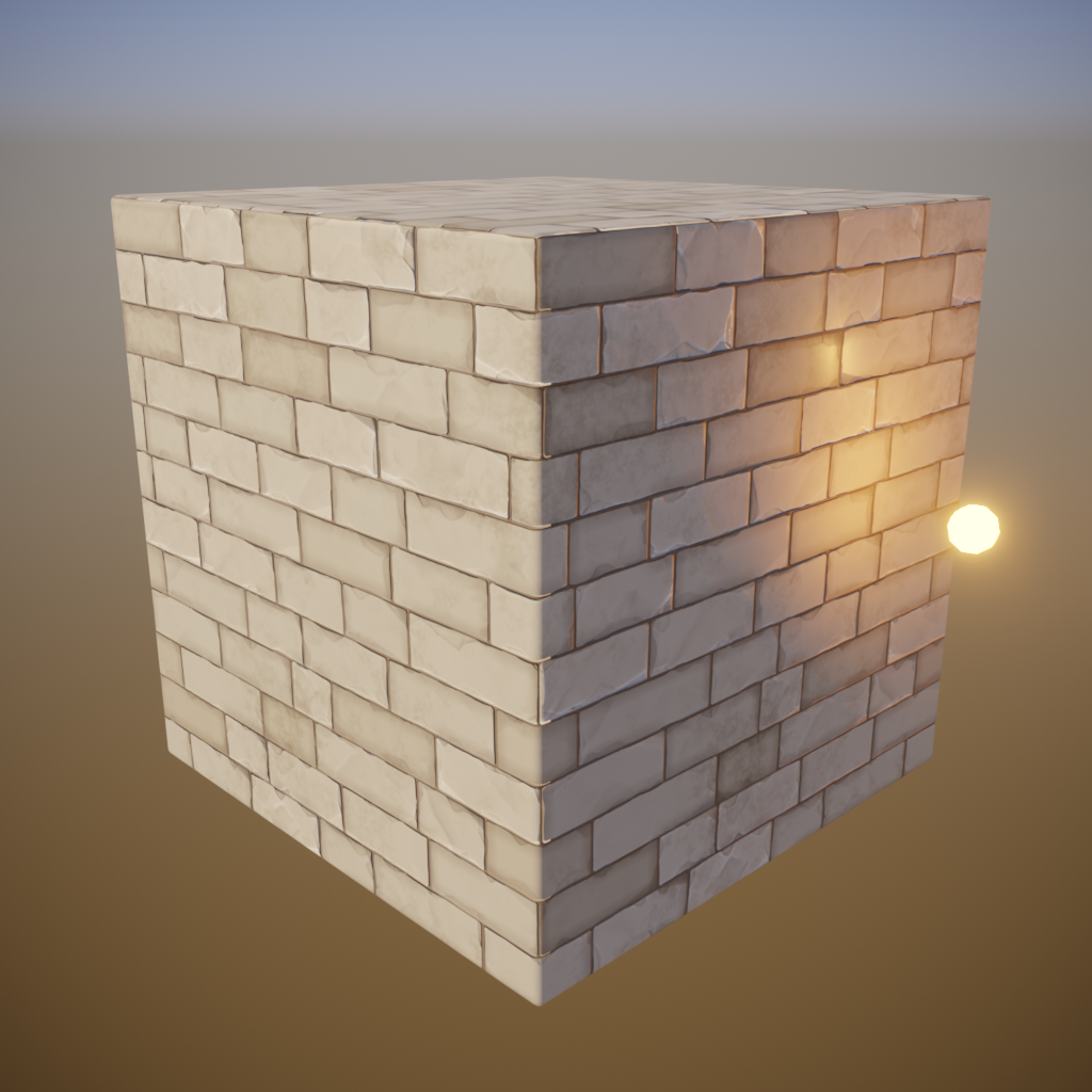
Below, I began working with 3D to accurately represent our texture style in Substance, so they could be procedurally used across all the buildings in the city to save time. This involved many paint overs, and working with the artists to develop our exaggeration style. It had to echo real textures, but be simplified enough to read at a distance.
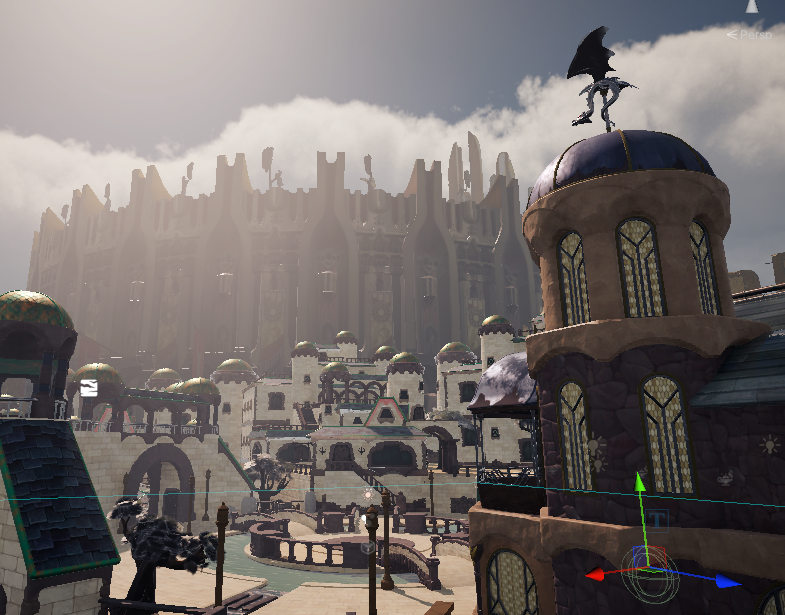
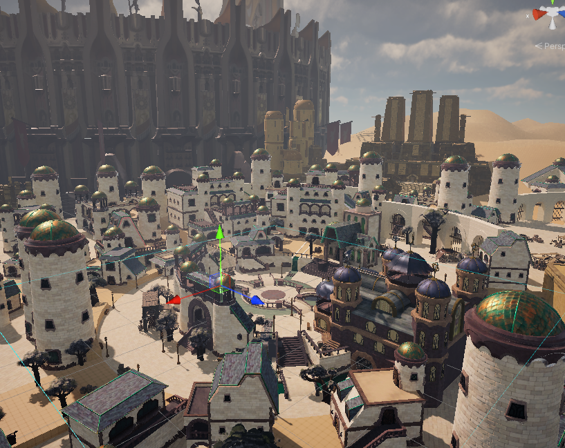
Here are a few progress shots of the slice coming together

1. Horizon - For the vertical slice, additional concepts were created for the structures visible on the horizon. We then projected each of those onto low poly mesh. The team is currently working to flush out the full 3D for those structures, as they build the content leading up to them
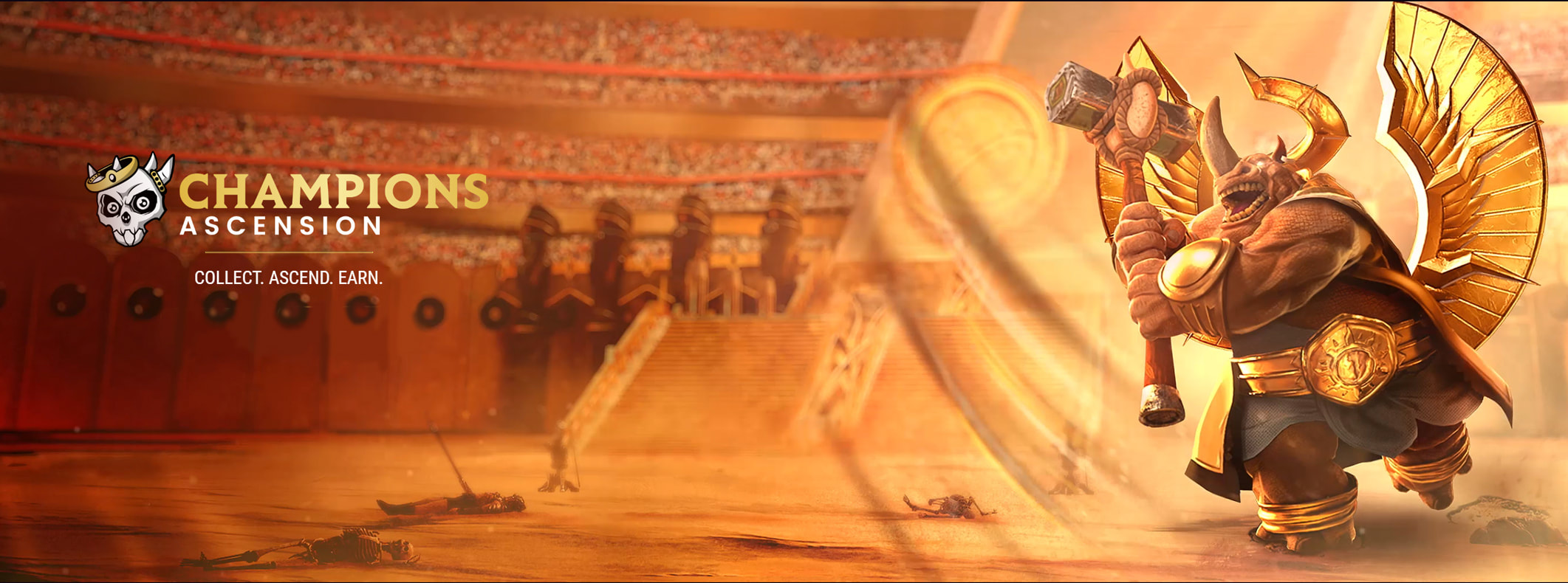
2. Roadmap Marketing Image - This was a request to accompany the roadmap release, and contains a ton of Easter eggs for the Discord community
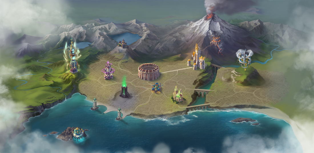
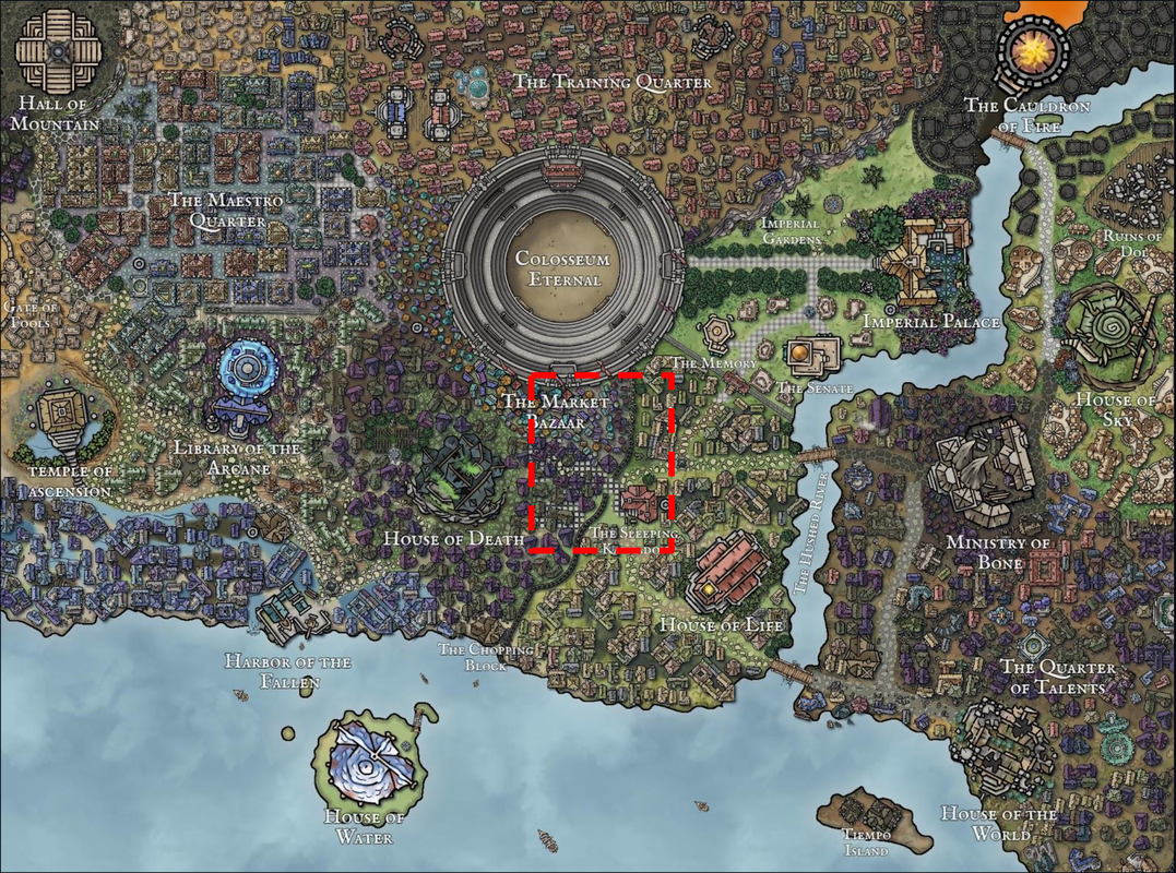
3. Interactive Map - This is a simplified interactive map for the website. Here you can see the larger structures, exaggerated for clarity, and click for more information
2. Roadmap Marketing Image - This was a request to accompany the roadmap release, and contains a ton of Easter eggs for the Discord community
3. Interactive Map - This is a simplified interactive map for the website. Here you can see the larger structures, exaggerated for clarity, and click for more information